
Okay, I’m a bit annoyed at WordPress. I had this all written out, and then the kind WordPress deleted it all for me. 🙂
Today I actually don’t have a prompt for today. I was brainstorming what to do that was slightly Christmasy, but still something that will last well through January and February, and so I came up with some evergreens. I wanted to give it a new twist, and so I chose my least used and detested art medium, water colors.
It seems that most artist really enjoy water-color, so I went with what the majority seems to enjoy. What you’ll need for the art project is:
~water color paints~
~water color paper~
~pencil~
~brush~
~water~
~white acrylic paint~
So, to get started, grab your paper and pencil.
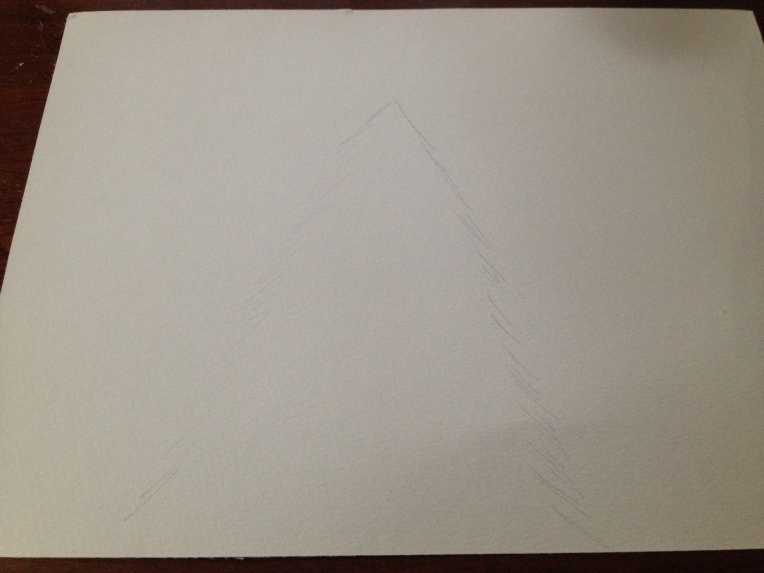
Lightly sketch your main pine tree. I decided to do a typical pine tree, even though I’ve never seen this type where I live. In the South, our pine trees look like this.
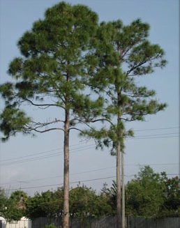
When I was little, I asked my mom why pine trees in the Christmas books didn’t look like real pine trees. Apparently those kind of pine trees grow where it snows.
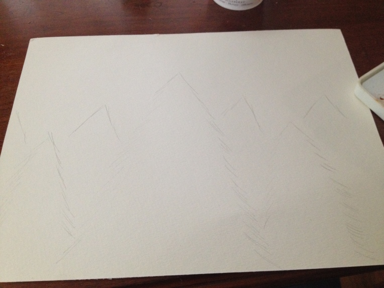
I decided to do four different colors on my picture, with four different zones. Zone one is the farthest from focus, and zone four is closest. I did zone two as mere peaks, and then added slight detail for zone three. Now, grab your paints.
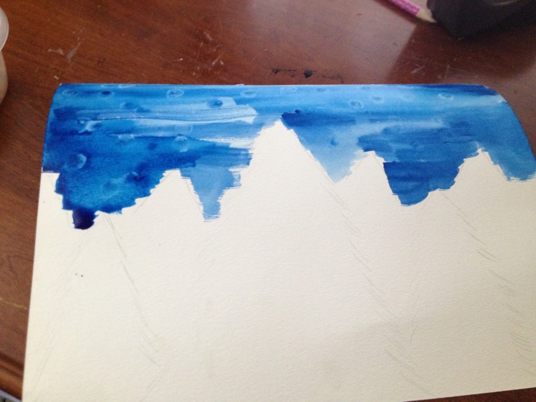
Honestly, I don’t understand how you would like water colors. They stress me out. XD But, I chose the dark blue paint for the sky, and slathered it on there. While it was still wet, I used my finger tips to add texture. I think that’s my favorite part of the whole picture. 🙂
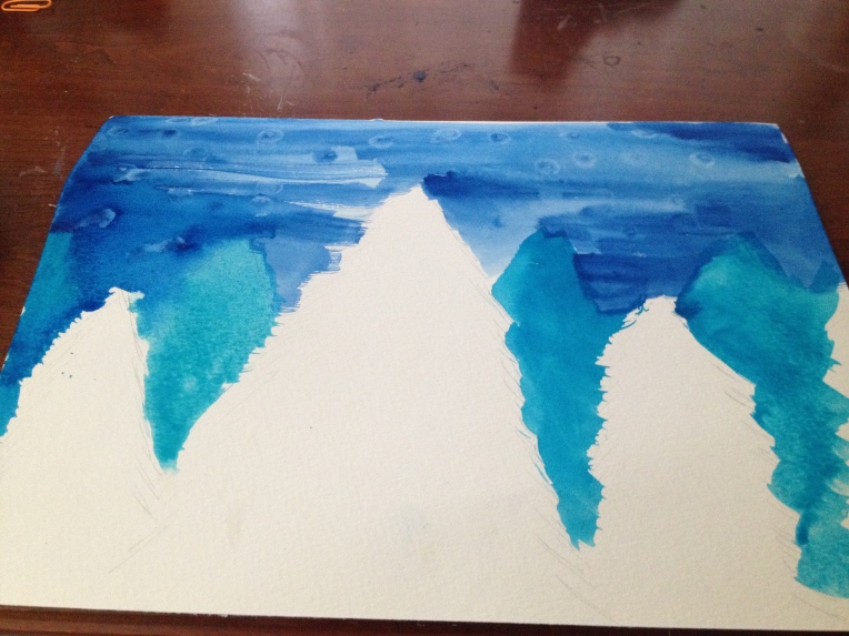
For zone two, I chose blue-green, and put it on there. Since the dark blue was still wet, they kinda combined, but I actually decided I liked that look. Now it was less defined.
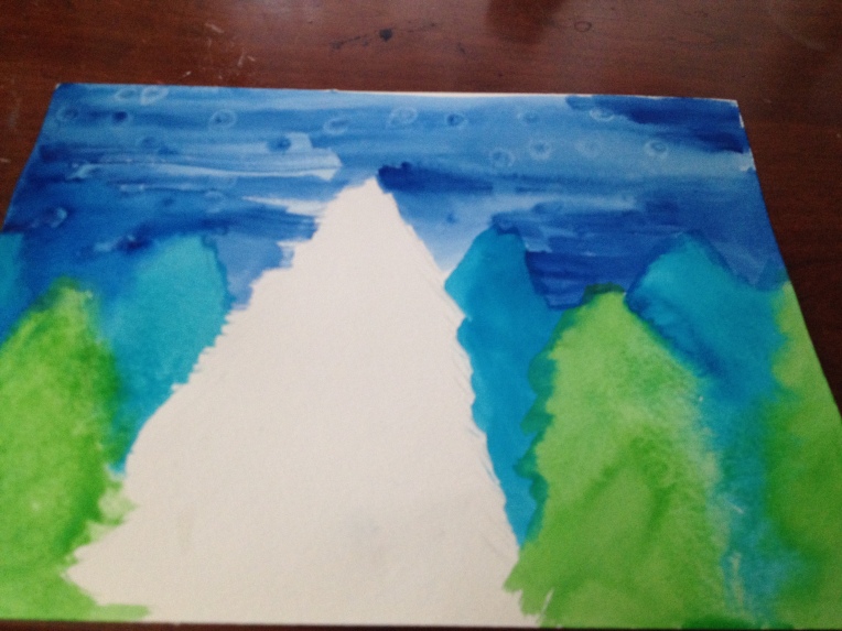
For zone three I used the brightest green I had. I love the pop of color, and I just slathered it on.
On zone four, I took dark green, and added dark areas here, and lighter areas there, until I was happy with it. Just play around until it agrees with your eye. 😀
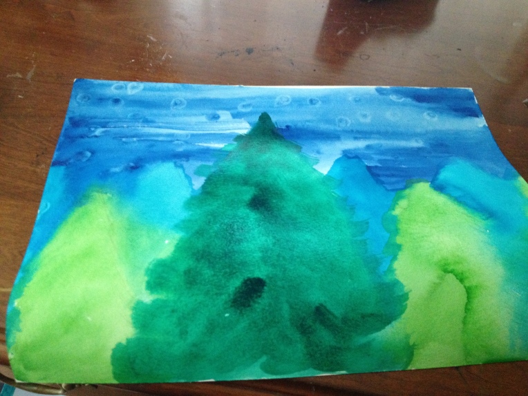
Now, I kinda forgot to take a picture in-between? So, we’ll have to go with this. The paint had started drying, and so I took the light green and used it to define zone three slightly. Don’t go over board, because we don’t want the viewer’s eye to be drawn there. Take the dark blue and add it to zone four, along with some dryer dark green.
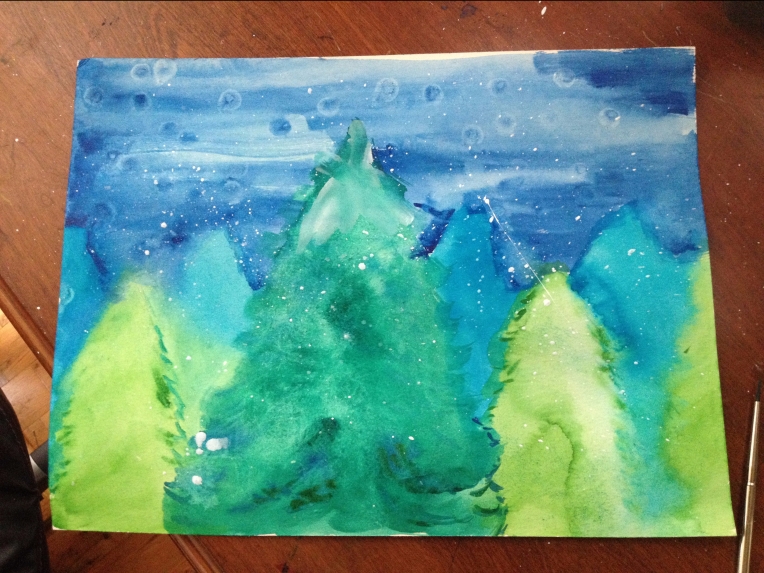
Next, take some acrylic and mix it with water. Put some white on the top of zone four, and then take the left over and splatter it all over the picture to make it look like snow. Let the picture dry before you sign it, and you’re done.
Do you enjoy water-color? Are you looking forward to the holidays? What is your favorite Thanksgiving food?
~~Amie~~

I love the blurry effect. It seems like I’m looking at it through the fog.
LikeLiked by 1 person
Ooh, just what I was going for. I wanted it to be a rainy/snowy/weathery/foggy look. 😀
LikeLiked by 1 person
Ooh, this is a great idea, Amie! I love the way you have some evergreens fading into the distance in a bluer color. It really adds depth and interest to the picture! Also, splatters make everything better. *nods seriously*
P. S. I think you did quite alright with watercolors, but please don’t feel like you should make a tutorial with them because that’s what everyone else does. In fact, I enjoy reading your tutorials about things I don’t know as much about, such as pastels! 😀
LikeLiked by 1 person
Awe, thanks, Allison! I will stick with tutorials of things I love, adding things I don’t enjoy sometimes. It’s more challenging to do tutorials of things you have to play with to make them nice, you know? I’m glad you like the painting. 😀
LikeLike
Yeah, that makes sense to me! 😉 You’re welcome, dear!
LikeLiked by 1 person
Awesome!!!! great job!!!
LikeLiked by 1 person
Thanks, Lucy!
LikeLiked by 1 person
No problem!!!! BTW I LOVE your blog!!!! it’s really creative and fun!!!!
LikeLiked by 1 person
Aw, thanks! I’m glad you enjoyed it!
LikeLiked by 1 person
Awesome Amie!😱😍
LikeLiked by 1 person
Thanks, Autumn!
LikeLike